In Excel 2016 you will find a new awesome chart called the TreeMap chart. The TreeMap is like a square pie chart, but it has the added ability to show a hierarchy.
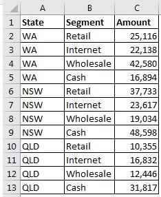
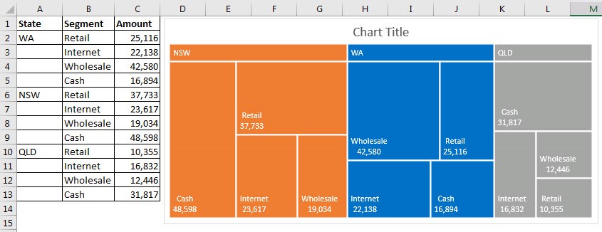
The data we will use is shown below. We have states broken down by segments, each with a value. Four segments for each state.
A Pie chart won’t work in this instance. The TreeMap chart will show the values as squares or rectangles. The size of the rectangle represents the size of the value. See the example below.
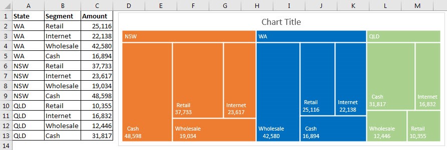
I have changed some of the default settings to arrive at the chart above.
I have deleted the legend and I have added the Banner option for the Data Series – see the image below.
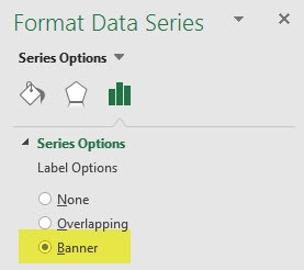
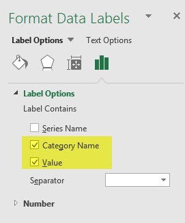
The overlapping option doesn’t always work as planned. Also note that the banner is grey when it is initially installed. You need to select each major category and then update the fill color to ensure the banner is the same color as the category. I have also added the values to the labels – as per the image below.
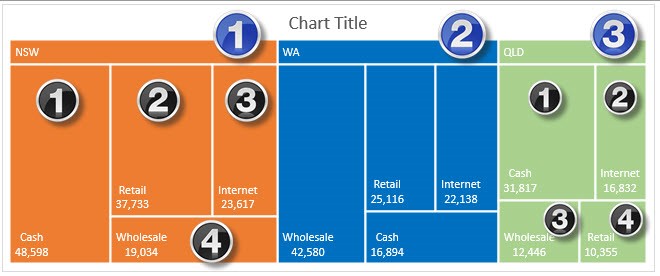
How To Read the Chart
- The chart is meant to be read from left to right.
- NSW (1) is the largest state by total amount and is on the left. WA (2) is in the middle and QLD (3) on the right with the smallest total amount.
- Within each colored section the top left is the highest value – Cash in NSW, Wholesale in WA and Cash in QLD.
- Within each color as the values move to the left they decrease.
- The values also decrease when they are displayed below. The rankings are showed in the image below. Bottom right is always the lowest value within each color.
Unfortunately there are not any options to move the labels. As well as the layout at the top of this post the TreeMap chart will also work with the layout shown below.
Supported in Microsoft Excel Versions
Microsoft Excel 2016 and later. This includes both Office 365 Microsoft Excel 2016 and stand alone Microsoft Excel 2016 versions.
